Whether you’re a seasoned real estate pro or your eyes started to glaze over the second you saw numbers on the most recent Ruiz Report, here are 5 easy-to-follow tips for getting the most out of our expert analysis!
1. Just want the basics? The “At A Glance” slides are for you.
Whether you only have a moment to check the latest stats or you’re just looking for the monthly and yearly breakdowns, the “At A Glance” slides should be your go-to’s. You can get a great sense of the market just by looking at the numbers and colors on this slide at a glance.
Each call-out has a very simple layout that remains the same on every report:
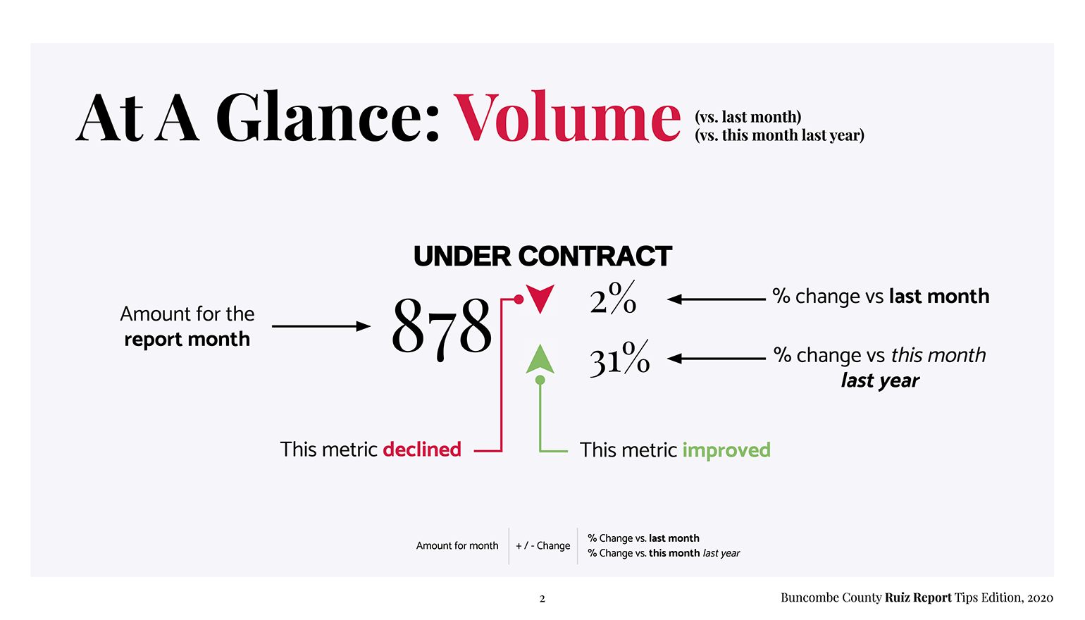
Green arrows represent positive improvements and red arrows signify declines for that metric. This is not to be confused with increases or decreases - more new listings are generally a good thing (green up arrow) while more days spent on the market (DOM) are generally bad (red up arrow). The color will tell you the basic good/bad and then the %-change will tell you how good or bad.
See something that piqued your interest? Each of these call-outs are taken directly from their graphical representations on the proceeding slides - just jump ahead to dig in deeper!
2. Only care about your specific price range? Skip to slide 4.
Just about everything you need to know about your price range can be found on slide 4. Each metric can be interpreted from either a Buyer or Seller’s point of view, and looking at them from both perspectives is probably the best way to go about it.
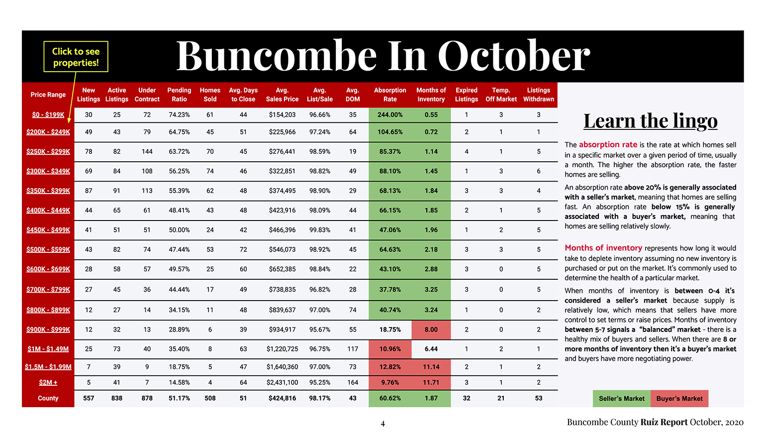
Thinking about putting in an offer 10% below asking? You might want to think again if the average list to sale ratio is hovering around 98%. Haven’t received any offers or only receiving “low ball” offers? Your list price is probably too high if your price range is selling at 98% list/sale (I hope your Realtor consulted the data before pricing your home?!). Putting yourself in the other party’s shoes is always a good strategy when it comes to negotiating, and real estate is no different in that respect.
Being able to have a clear view of the numbers for your price range is incredibly useful, but you should always do some basic market research to see what’s already out there. Actually seeing the houses behind the numbers is an invaluable exercise to give you a true feel for the market. Your Ruiz Report makes that as simple as clicking the price range.
Clicking any of the price ranges on the left on slide 4 will take you directly to the available homes in that market for the report’s county! If you’re lucky enough to have one of our Realtor partners’ reports then clicking the links will keep you in their wheelhouse and take you directly to their website so you can see and ask questions about every available home in your market!
3. Each graph is a 15-month view of the market. Use that to account for seasonality.
Volume 1 of the Ruiz Report only showed the preceding 12-months, but that left out a very important tool for our analysis - seasonality. Thanks to some great user feedback we were able to implement the now standard 15-month view the very next month in Volume 2, so please don’t hesitate to reach out and send us a note if you have any suggestions for improvements!
Looking at the graph below we can see that the average price of a home in Buncombe County was higher than it was last October but it dropped from last month’s record high in September… Do prices usually drop during In October? Do prices usually rise in September?
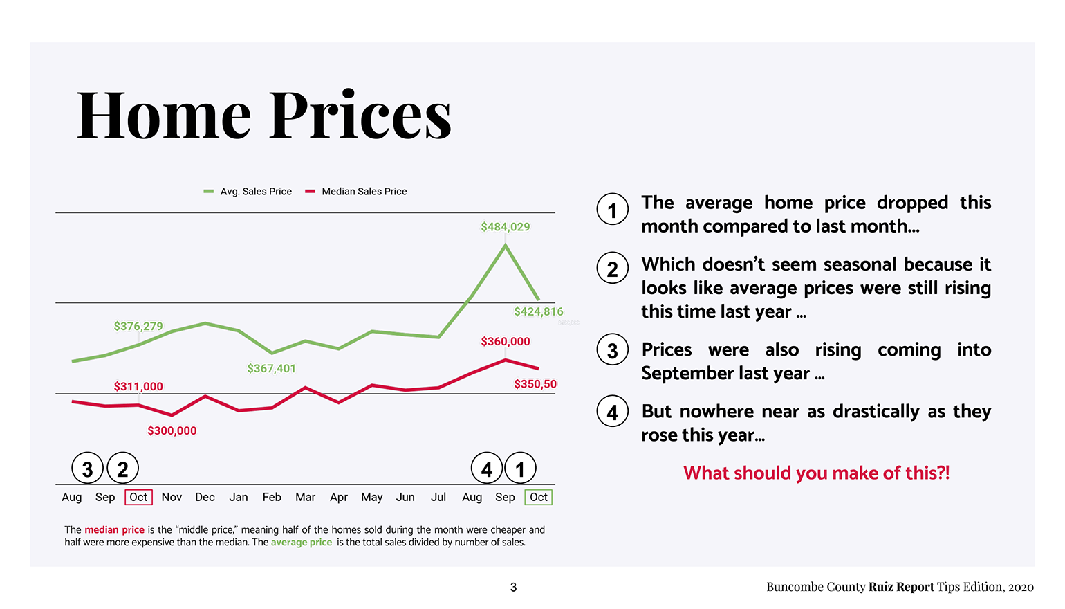
At the bottom of each graph you’ll notice that the current month has a green box around it, while the same month last year is boxed in red. To the left of that is the preceding 2-months to give you an idea of how things played out last year during this time of year so you can factor in some seasonality to your analysis.
You’ll also notice that both Octobers have numbered data points but not every month does… That’s because:
4. Each graph has anywhere between 3 to 5 numbers to get you going.
The reason there aren't call-out's for every data point is to focus on the 5 most important numbers from the last 12-months to get you started. With those numbers in view the rest of the “trend analysis” can be done with your eyes - no math required!
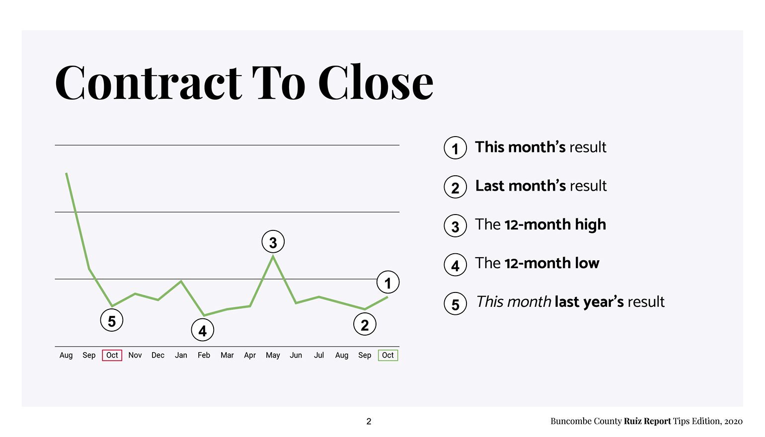
So why do some graphs only have 3 or 4 numbers? Well, sometimes the same value can meet two of our requirements. For instance, last month’s value could also be the 12-month high, so you’d only have 4 call outs in that situation. Additionally, this time last year’s results could also be the 12-month low, and those two combined would mean there would only be 3 total call outs.
Even though these metrics serve as a great start to any analysis, it’s important to note that these numbers are for the entire county, so you wouldn’t be doing yourself any favors not digging in deeper. We’ll talk more about drawing insights for your particular price range (your “micro-market”) from this larger “macro-market” next!
5. Compare your “micro market” from slide 4 to the “macro market” views to put things in perspective.
Congrats! You’ve now got the tools to put it all together! As you should now know, the Ruiz Report is designed at the county-level. This means that for our purposes the county is the “macro market.” As useful as this information is to me as your local economist of choice, chances are if you’re in the market to buy and/or sell then you’re probably most concerned with how these trends affect your price range, aka your “micro market.”
The relationship between your micro market and the county’s macro market is where all of the interesting insights are hiding and where you’ll be able to get the most out of your Ruiz Report. Some easy ones you should be looking up right off the bat are:
- What’s your price range’s avg. DOM vs the market (slide 8)? Is your market moving faster or slower than the county?
- What’s your price range’s avg. days to close vs the market (slide 9)? Should you be budgeting more time in your offer or planning for your sale to take a bit longer once under contract?
- How do any of the metrics in your price range compare to the next one up and down the line? Might you have better or worse luck if you were looking to buy or sell in another bracket?
That’s it for this down-and dirty guide to getting the most out of your Ruiz Report. These are just 5 easy tips to get you going, but as you can imagine there’s a lot more where these came from!
If you’re into this type of analysis and think your Realtor should be too then you should work with us! I personally take a data-driven approach to real estate with my clients and my Ruiz Report partner Realtors do too. I’d love to either work with you directly or to match you with the best Realtor in our network for your unique situation.
I’d also highly encourage you to sign up for our newsletter to get the Ruiz Report delivered right to your inbox every month, and to read our blog for our ever-growing resource of expert market analysis to make sure you’re staying current with both the “macro-market” as well as the “micro-market!”
Thanks for your time and good luck out there!